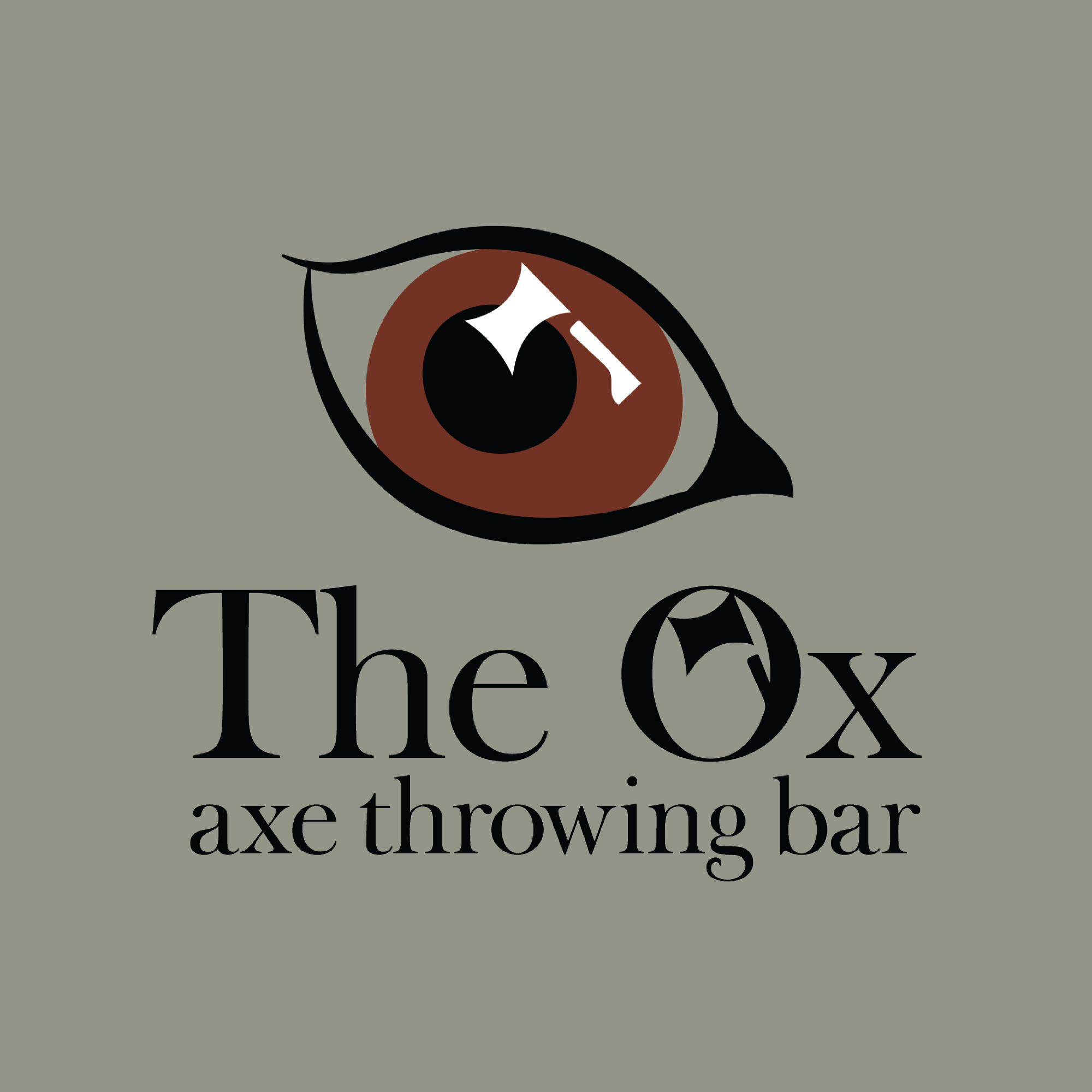
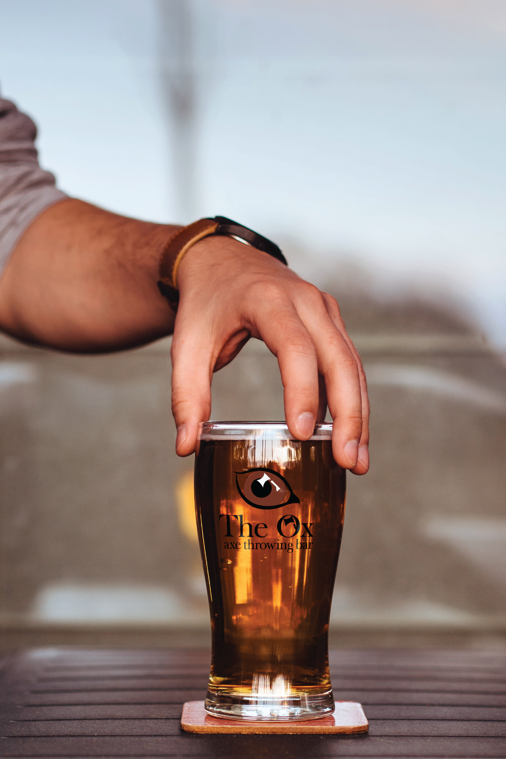
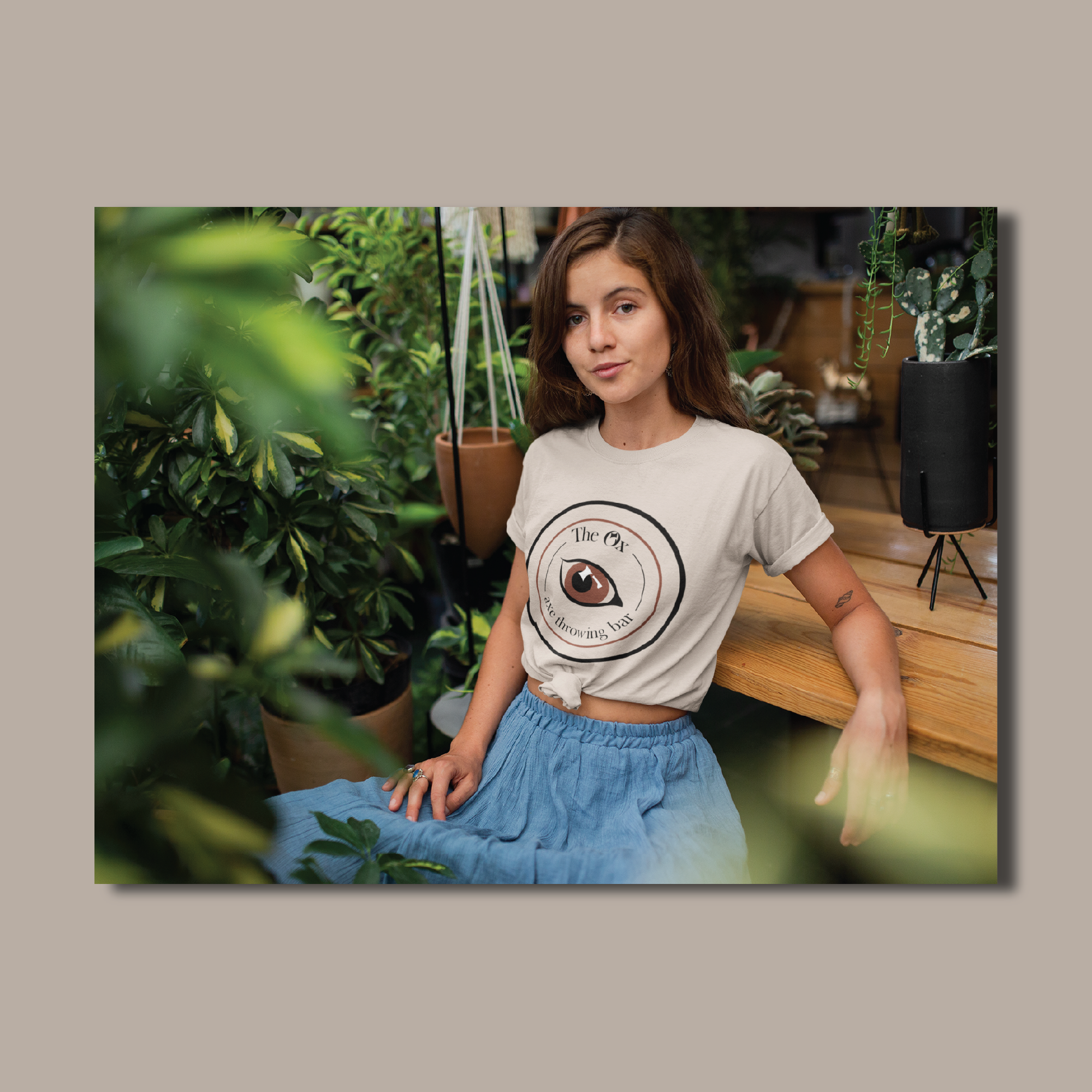
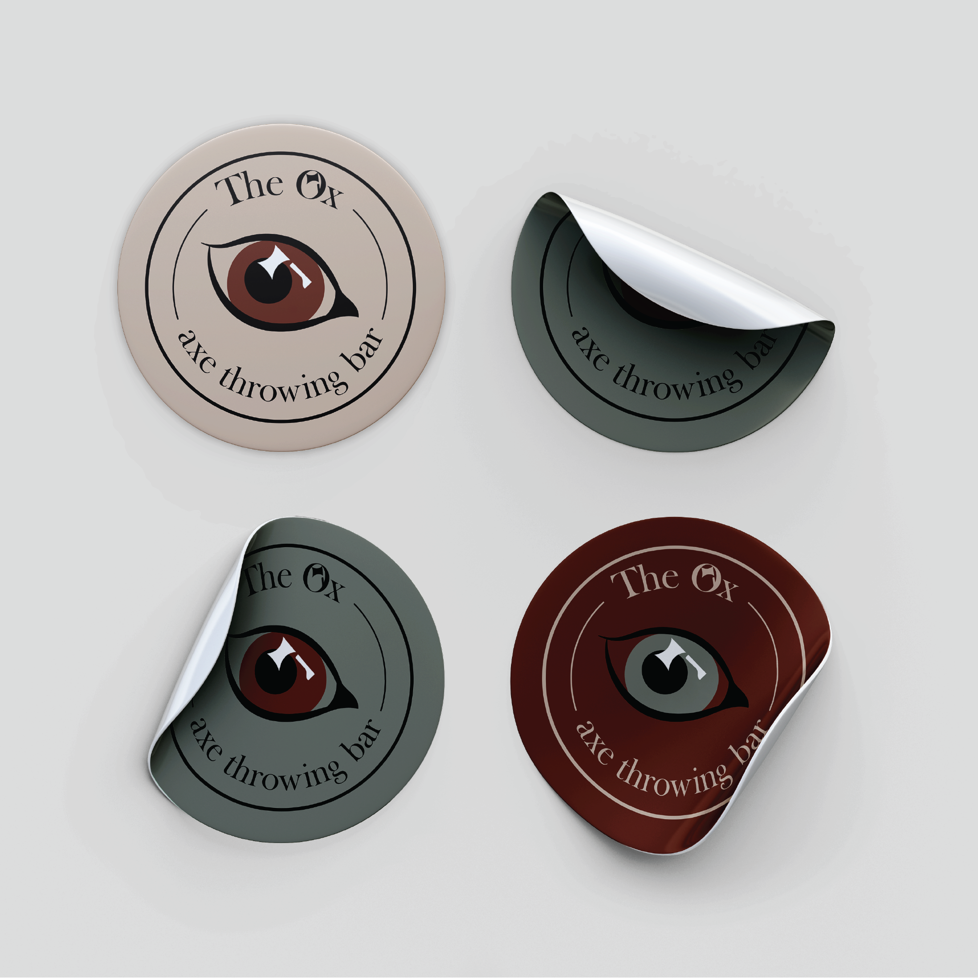
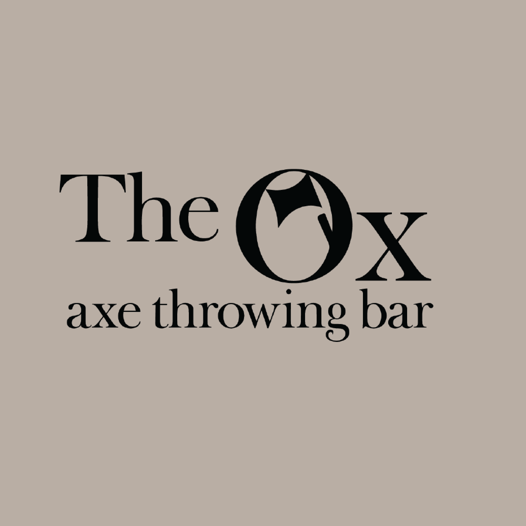
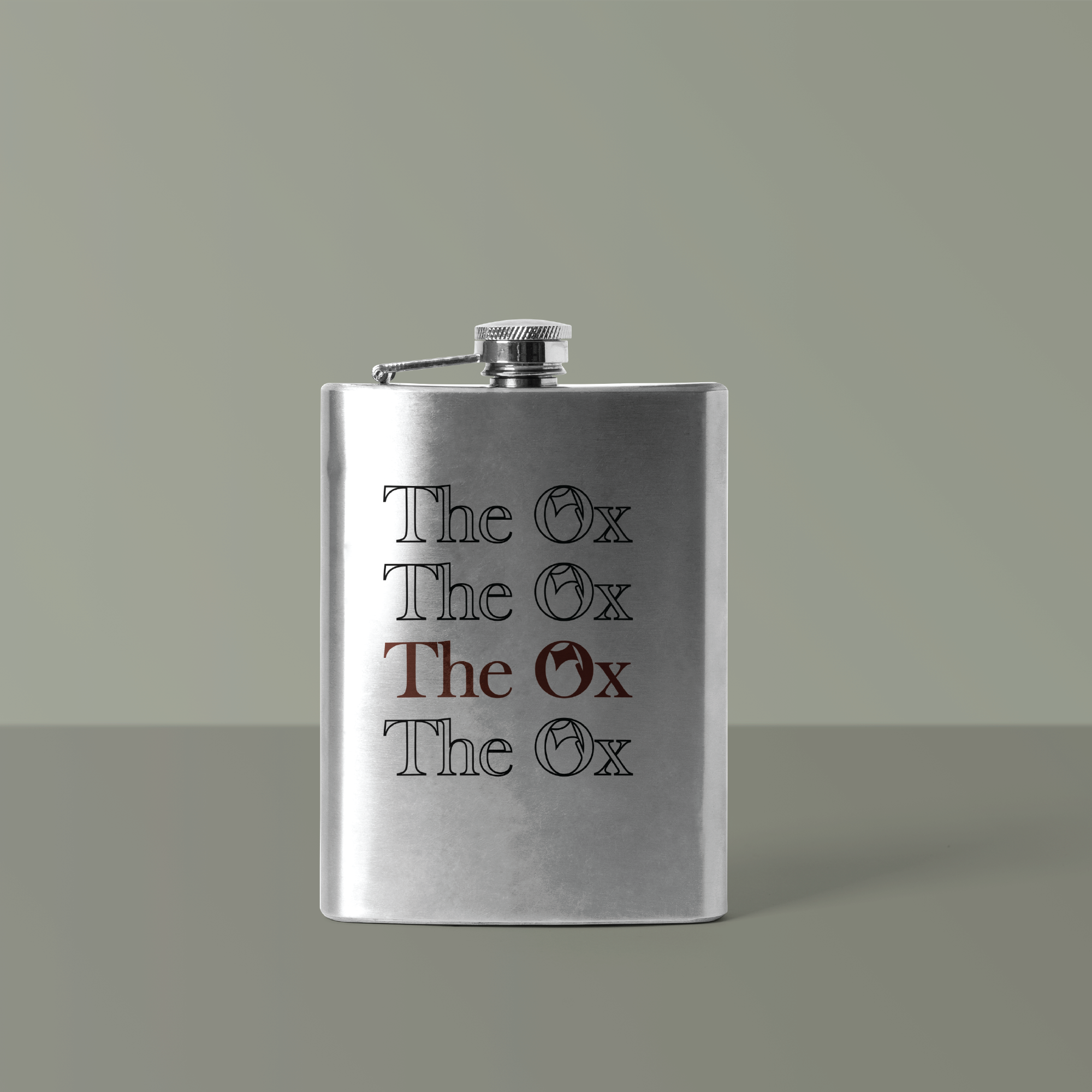
This a conceptual branding identity for the faux company, The Ox. The Ox is a cutting edge bar based in Chapel Hill that offers high-end craft beer, cocktails, and axe throwing. The branding is intended to reflect the urban, edgy, and sophisticated ambience of the bar. I was inspired by the crisp letterforms, mysterious themes, and geometric illustrations that are found in vintage band tees.
The primary logo is a simple serif wordmark with the illustration of an axe within the O. The wordmark has a minimalistic and sophisticated spirit due to its thin and pointed serifs. The secondary logo is an Ox’s eye, which plays on the idea of a bull’s eye. The illustration has a piercing and mysterious energy in order to add edge to the branding. The color palette includes swatches of pale pink, jade green, sienna red, and black. The mix of colors are harmonious because they balance softness, elegance, and power. The color palette, typography, and illustrations were carefully designed in order to reflect The Ox’s urban, energetic, and modern atmosphere.